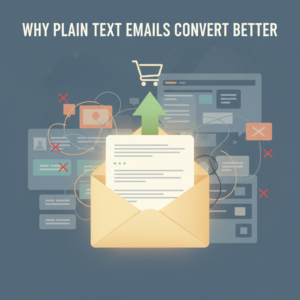
Why Plain Text Emails Convert Better Than HTML
I used to believe that beautiful design sold products. I spent hours tweaking layouts, choosing colors, and adding glossy images to my marketing emails. I thought I was doing everything right. Then, I looked at the numbers.
I was wrong. And if you are spending money on expensive email designs, you might be wrong too.
Large-scale data backs this up. HubSpot research found that adding images or GIFs to an email can drop open rates by nearly 37%. That is a massive loss of potential customers before they even read your message. I dug deeper into the research to understand why this happens.
It turns out, plain text emails usually win. They land in the inbox more often, they are easier to read, and people trust them more. In this article, I will show you the exact technical and psychological reasons why simple text gets better results than fancy HTML.
< figure class="article-image-container" >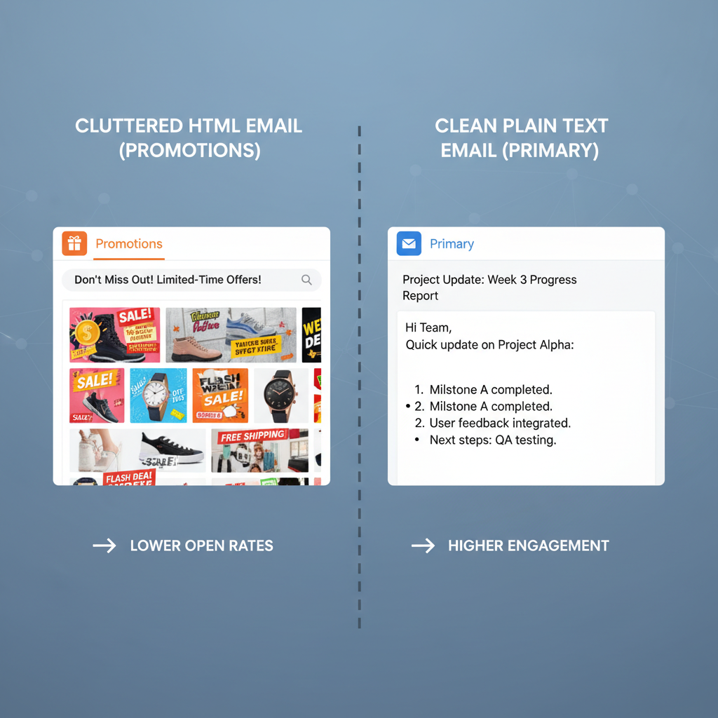
Technical Differences Between Plain Text and HTML
The main difference here is the code. HTML emails act like mini-webpages. They have tags for layout, fonts, and tracking. Plain text is just characters. It is the digital version of a typewritten letter.
This difference changes how email providers treat your message. I learned that keeping the code simple is the secret to getting seen.
Impact on Email Deliverability and Spam Filters
Gmail and Outlook use filters to decide if your email is junk. They look at the ratio of code to text. If your email has heavy coding or big image files, filters often flag it. They might send it to the Spam folder or the Promotions tab.
I found two major changes in 2024 that make this even more important:
- New Sender Rules: Gmail and Yahoo now have a strict rule. If 0.3% of people mark you as spam, you are in trouble. Fancy templates often look like mass marketing, which leads to more spam complaints.
- Google's RETVec Technology: This is a new system Google uses to read emails. It stands for "Resilient and Efficient Text Vectorizer." I know that sounds complex, but here is the simple version: Google now reads your email like a human. It looks for hidden "marketing-speak" inside HTML code. Plain text is transparent. It looks like a real message, so it bypasses these strict filters easier.
Compatibility Across Mobile and Wearable Devices
I check my email on my Apple Watch constantly. I bet you do too. Or maybe you check it on your phone with a weak signal.
HTML templates often break in these situations. The layout gets messed up, or the images don't load. But plain text always works. It adapts to the screen size automatically.
Statista predicts there will be 4.6 billion email users by 2025. Many of them use mobile devices exclusively. If you send a plain text email, you know every single one of those users can read it. That is a guarantee HTML cannot make.
< figure class="article-image-container" >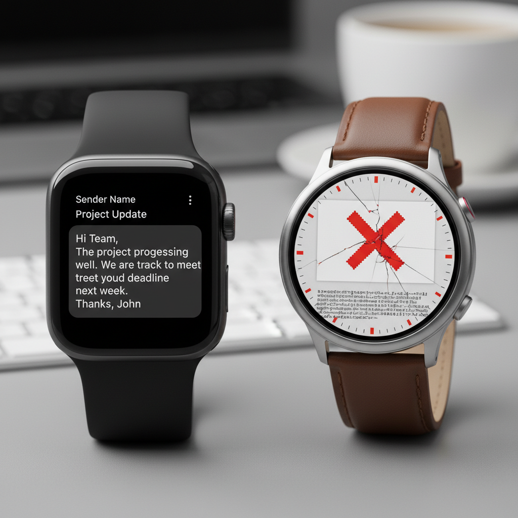
Performance Data and Statistics
You don't have to take my word for it. I gathered recent data from 2023 to 2025 to prove this point. The numbers show a clear winner.
Open Rate Comparisons from 2024 Case Studies
Open rates tell you if your email actually landed in the main inbox. The data I found suggests that simplicity drives delivery.
- HubSpot: They ran A/B tests and found that using GIFs or heavy images dropped open rates by 37%.
- Warmforge: In their 2025 data, cold emails with heavy HTML templates got 23% fewer opens than text-only versions.
- MarketingSherpa: They highlighted a case study where a software company switched to plain text. Their open rates jumped to 60%.
I was surprised by how consistent these numbers were. It seems that the more "designed" an email looks, the less likely people are to open it.
Click-Through Rate Lifts in Plain Text Campaigns
Getting an open is good, but you want clicks. This is where plain text really shines.
According to data from IInfotanks, plain text emails have a 21% higher click-to-open rate than HTML emails. Why? Because there are no distractions.
I noticed another interesting stat from Warmforge regarding sales emails. Plain text formats generated 42% more clicks in cold outreach. When an email looks like a personal letter, people are more curious about the links inside. They trust that the link is valuable, not just a "Buy Now" button.
< figure class="article-image-container" >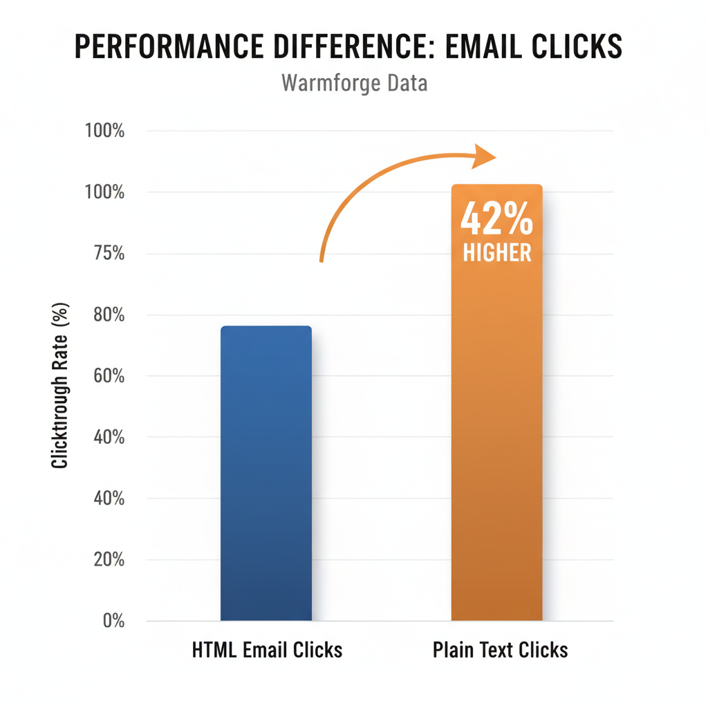
Accessibility and Inclusivity Requirements
This is a topic I feel passionate about, and many marketers ignore it. Accessibility isn't just about being nice; for many businesses, it is the law.
Compliance with ADA and Section 508 Standards
The Americans with Disabilities Act (ADA) and Section 508 require digital content to be accessible. Section508.gov states that emails need specific contrast ratios (at least 4.5:1). They also need a logical reading order.
When I write in plain text, I am compliant by default. The user's device handles the font size and contrast. If I use a complex HTML template with light gray text on a white background, I might be breaking the rules. I prefer to play it safe and inclusive.
Performance for Screen Reader Users
Screen readers are tools that read text out loud for visually impaired users. I tried using one on a table-based HTML email once. It was a mess. It read the code structure out loud and jumped around the page.
Plain text reads linearly. It starts at the top and goes to the bottom. Harvard University recommends simple text for this exact reason. By stripping away the layout, you ensure that every single person on your list gets the same message.
Psychological Factors in User Engagement
Technical stuff aside, how does the email feel to the reader? I believe this is the biggest factor in conversion.
Reduction of Marketing Banner Blindness
We all have "banner blindness." I do it, and you probably do too. When I open an email and see a big header image and a colorful sidebar, my brain says, "This is an ad." I instantly tune it out.
Plain text emails look like a message from a friend or a colleague. They bypass that mental filter. When I see a simple text email, my brain says, "This might be important personal news." I pay attention.
The Effect of Personal vs Promotional Tone
I looked at survey data from Databox regarding B2B preferences. Users prefer plain text because it feels personal. A polished HTML template feels like a mass broadcast sent to a million people.
A text-based email implies that I sat down and wrote it just for you. Even if it is automated, that feeling of personal effort matters. It increases trust. And in sales, trust is what gets the reply.
< figure class="article-image-container" >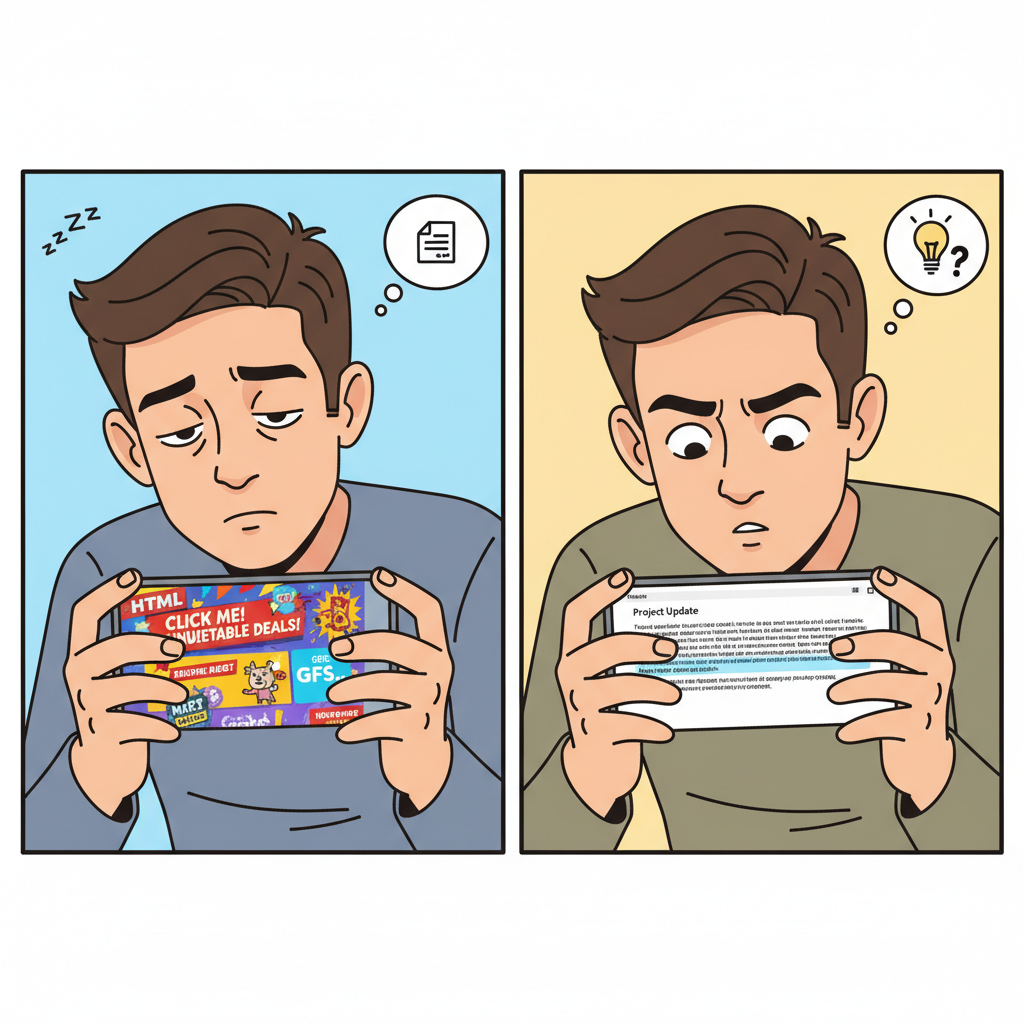
Implementation Steps for Plain Text Emails
Ready to try this? I have switched most of my campaigns to plain text. Here is how I make them look good without the code.
Optimizing Link Placement and Whitespace
Since you don't have big orange buttons, you have to be smart about your links.
- Use Whitespace: I press "Enter" frequently. Short paragraphs are easier to read. It gives the eyes a break.
- Anchor Your Links: Don't bury the link in a long paragraph. Put the main Call to Action (CTA) on its own line.
- Keep it Simple: I try to write at an 8th-grade level. Simple words work best.
Setting Up Multipart/Alternative Email MIME Types
This sounds technical, but it is important. You still want to track who opens your emails, right? To do that, you need a tiny bit of HTML (a tracking pixel).
I recommend using a "Hybrid" approach. You send the email as a Multipart/Alternative MIME type. This sends two versions at once:
- A lightweight HTML version that looks like plain text but has a tracking pixel.
- A true plain text version with zero code.
If the user's device (like an Apple Watch) hates HTML, it automatically shows the text version. If they use Gmail, they see the trackable version. It is the best of both worlds. Most email tools like HubSpot or Mailchimp handle this for you automatically.
My Final Thoughts
I know it is tempting to make things look "pretty." We all want our brand to look professional. But the data I found is clear. In email marketing, "professional" means "readable."
Plain text emails get through spam filters better. They work on every device. They are accessible to everyone. Most importantly, they feel human.
I challenge you to test this. Take your next campaign, strip out the images, and write a simple letter to your list. I bet you will see the difference in your numbers. I certainly did.