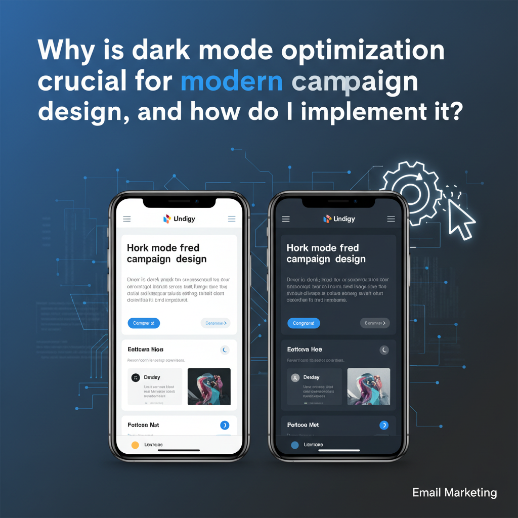
Why Dark Mode Optimization is Crucial for Email Design in 2025 (Plus: The Ultimate Implementation Guide)
Imagine spending weeks crafting the perfect email campaign. The copy is sharp, the CTA is compelling, and the layout is pixel-perfect on your desktop screen. You hit send.
Now, imagine 34% of your subscribers opening that email only to see a broken, unreadable mess. Your carefully chosen black text has vanished into a dark background, and your logo looks like a cheap sticker inside a clumsy white box.
That is the reality if you ignore dark mode today. In my decade of experience coding HTML emails, I've seen the shift from "nice to have" to "absolute necessity." It used to be a stylistic preference; now, it's a deliverability standard.
According to Litmus's Retrospective 2024 State of Email Trends, approximately 34% of users view emails in dark mode. That number represents a massive segment of your audience that you are potentially alienating with unoptimized code.
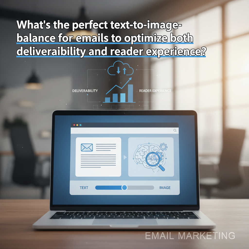
This isn't just about aesthetics—it's about protecting your ROI. In this guide, we move beyond the "it looks cool" argument to the hard data, the accessibility compliance nuances, and the specific copy-paste code fixes you need to conquer the notorious Outlook and Gmail rendering engines.

The Data-Driven Case: Why Dark Mode isn't Just a Trend
If you're trying to convince your stakeholders to invest time in dark mode optimization, anecdotal evidence won't cut it. You need hard data. The adoption rates in 2024 and heading into 2025 show a "silent majority" that dictates we can no longer design for white backgrounds by default.
1. The "Silent Majority": Adoption Statistics
The preference for dark interfaces has permeated every layer of digital interaction. According to data analysis by SalesSo / EarthWeb (2024), nearly 81.9% of smartphone users utilize dark mode settings as of 2024. While not all of these users force dark mode on their email clients, the overlap is substantial.
Google's Mobile Search Market Share (2025). With Android defaults often set to "Force Dark," optimization is mandatory.
Source: StatCounter Global Stats
2. The Battery Life Imperative
Why do users switch? It's not just about looking "tech-savvy." For many, it's a functional requirement to extend hardware life. A pivotal study from Purdue University (cited via ScienceDirect 2024 reviews) found that switching to dark mode can save 3-9% of battery power on OLED screens at moderate brightness, and up to a staggering 63% at maximum brightness.
When you force a light-mode design on a user who is consciously trying to save battery, you aren't just presenting a bad design; you are actively working against their device preferences.
3. The Accessibility Nuance (It's Not What You Think)
Here is where I need to offer a contrarian perspective to the general "Dark Mode is better for your eyes" narrative. As a developer, I've learned that accessibility is rarely black and white.
A 2024 study by Pathari et al. (UPV/IARIA) confirmed a significant reduction in eye fatigue when using dark mode in bright ambient conditions. However, the study notably found that benefits were negligible in dim lighting. This nuance is critical.
Stéphanie Walter, UX Researcher "Dark mode isn't always better for accessibility... if you build a dark theme, check your color contrast ratios. Don't forget to adapt the focus indicator." (Source)
Optimization ensures that regardless of the user's environment or eye condition, the contrast remains compliant with WCAG standards.
The "Dark" Reality: How Different Clients Butcher Your Code
If every email client handled dark mode the same way, this article would be three sentences long. Unfortunately, we live in a fragmented ecosystem. Understanding how your email breaks is the first step to fixing it.
I categorize clients into three buckets of behavior:
1. No Change Clients (The "Easy" Ones)
Examples: Apple Mail (with specific settings), Gmail Desktop, older Yahoo webmail.
These clients respect your code. If you define a white background, they keep it white. This is great for design consistency but bad for the user who wants a dark experience. They are essentially shining a flashlight in the user's face.
2. Partial Inversion (The "Tricky" Ones)
Examples: Outlook.com, Gmail App (iOS/Android).
These clients detect light backgrounds and invert them to dark, and turn dark text to light. However, they usually leave images and complex background graphics alone. This often results in the dreaded "invisible text" issue if you are using dark grey text on a white background—the client might invert the background to black but fail to invert the dark grey text enough to make it readable.
3. Full Inversion (The "Nightmare" Scenarios)
Examples: Windows Mail, Outlook 2019 (Windows).
These clients are aggressive. They will invert everything, often including background images and sometimes even colors inside your graphics if they aren't handled correctly. This is where brand colors go to die. A beautiful navy blue might be inverted to a sickly neon orange.
Step-by-Step Implementation Guide (With Code Snippets)
Now, let’s get technical. To create a "bulletproof" dark mode email, we need to use a layered approach. We start with standard CSS and then layer on the specific hacks for Microsoft’s rendering engine.
Step 1: Enabling Dark Mode in <head>
First, we need to tell the email client that we support dark mode. This prevents some clients from applying their own forceful, ugly auto-inversion logic because they see that we have handled it ourselves.
Add these meta tags to your HTML <head>:
Step 2: The @media (prefers-color-scheme: dark) Standard
This is the standard CSS method supported by Apple Mail, iOS, and some versions of Outlook for Mac. It works exactly like responsive web design.
Step 3: The Outlook-Specific Hack ([data-ogsc])
This is the "secret sauce" that many guides miss. The Android Outlook app and some web versions strip out @media queries. However, they preserve [data-ogsc] attributes. To target these stubborn clients, you must duplicate your dark mode styles using this prefix.
Pro Tip: Ensure you add the dark-mode-bg and dark-mode-text classes to your HTML elements (tables, tds, spans) so these styles have something to target.
Step 4: Asset Optimization
Code can't fix a JPG with a white background. As Kevin George from Email Uplers notes in his 2025 trends analysis, "Support for dark mode is wildly inconsistent... but it is not a trend you should swipe left on." A major part of this support is asset management.
- Transparent PNGs: Always use transparent backgrounds for logos and icons.
- The "Glow" Effect: If your logo is black, it will disappear on a dark background. Add a subtle white stroke or "outer glow" to the PNG. It will be invisible on white paper but makes the logo pop in dark mode.
Design Best Practices for Conversion Protection
Coding ensures visibility, but design ensures conversion. Here is how to maintain your click-through rates (CTR).
Contrast Ratios & WCAG Compliance
Don't just guess. Use a contrast checker. In 2025, accessibility lawsuits are real, and poor contrast is the easiest thing to spot. Your text should maintain a 4.5:1 ratio against the background.
Button Design: The "Ghost" Button Trap
Avoid "ghost buttons" (transparent background with a colored border). In aggressive dark mode inversions, the border often gets inverted to a color similar to the background, making the button disappear. In 2025, filled buttons with solid borders are the safest bet for maintaining high CTR.
Case Study: The Cost of Ignoring Dark Mode
Does this actually impact the bottom line? Yes.
The Engagement Drop: A study by Publicare analyzed user behavior and found that dark mode users spent significantly less time reading non-optimized emails—often scanning for just 3-8 seconds compared to light mode users who engaged for over 8 seconds. If your email looks broken, they don't squint; they delete.
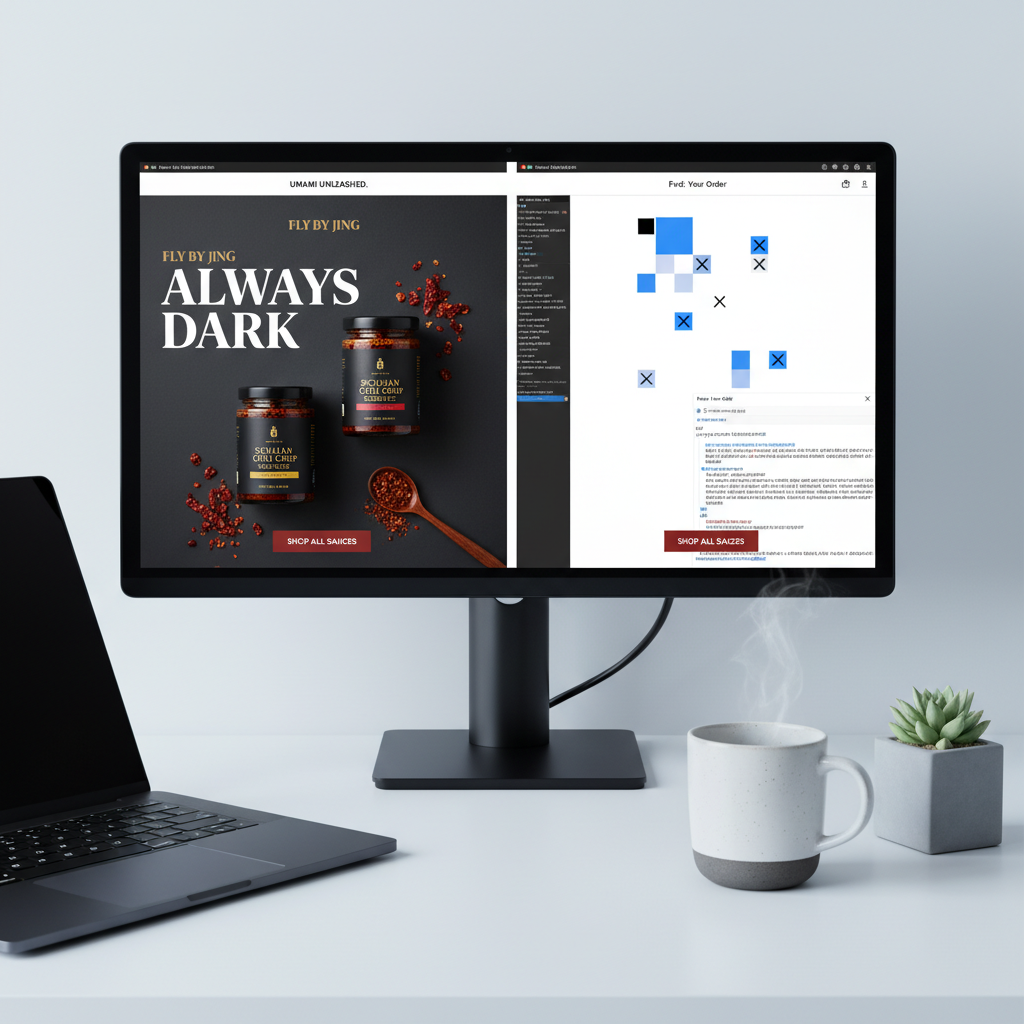
Success Story: Fly by Jing's "Always Dark" Strategy
I love the approach taken by the brand Fly by Jing. Instead of fighting the inversion wars, they design their emails with a "Deep Black" background (`#000000`) by default for everyone.
By forcing the design to be dark from the start (and using light text), they bypass the awkward inversion logic of email clients. The client sees a dark email and thinks, "Great, my work is done," leaving the colors alone. This creates a premium, high-contrast aesthetic that builds strong brand recognition.
FAQ: Troubleshooting Common Dark Mode Issues
Q: Why is my white text turning black in Outlook dark mode?
A: This is classic Outlook behavior. It sees white text and assumes it's a "light mode" email, so it inverts it to black. To fix this, use the [data-ogsc] hack mentioned above and add !important to your color styles to override Outlook's default behavior.
Q: Can I force my email to always show in light mode?
A: Technically, yes, by defining specific background colors and using !important tags on the body. However, I strongly advise against this. As Chad S. White from Oracle/Litmus states, "Email marketers may not see massive lifts from every trend, but dark mode optimization is about protecting the baseline experience." Blinding a user who is checking email in a dark room is the fastest way to get an unsubscribe.
Q: Why does my logo look like a white box?
A: You are likely using a JPG or a PNG with a white matte. Switch to a transparent PNG. If your logo text is black, apply a white outer stroke or shadow in Photoshop before exporting, so it remains visible when the background turns dark.
Conclusion: From "Nice to Have" to Deliverability Standard
Dark mode optimization in 2025 is no longer an optional "growth hack." With over 80% of smartphones utilizing dark themes and 34% of email opens happening in dark environments, sending an unoptimized email is akin to sending a letter with smeared ink.
The code fixes—like the [data-ogsc] hack and proper media queries—are straightforward once you know them. But the philosophy is deeper. It's about respecting your user's choice, preserving their battery life, and reducing their eye strain.
Don't let your next campaign fail because of a CSS oversight. Implement these changes today, test them rigorously, and protect the engagement you've worked so hard to build.