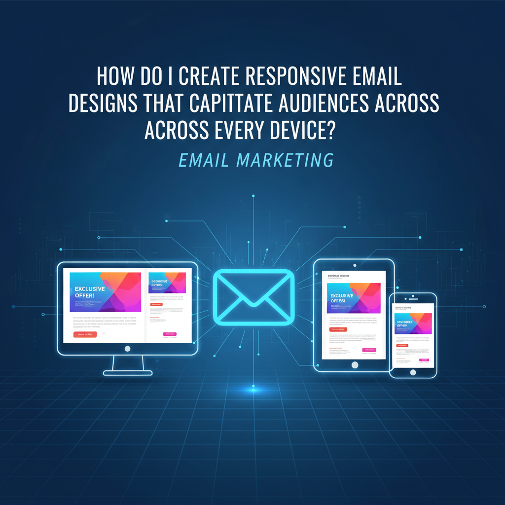
The Perfect Text-to-Image Balance for Emails: Deliverability & UX Guide (2025)
We need to talk about that moment of panic. You know the one—you’ve just hit "Send" on a campaign to 50,000 subscribers. The design looked stunning in your editor. A beautiful, single-image flyer promoting your new product line. But then, you check your metrics an hour later. Open rates are plummeting, and the click-through rate is nonexistent.
What went wrong?
Here is the uncomfortable truth: If your value proposition is trapped inside a JPG, you aren't just hurting your user experience—you are actively flagging spam filters.
In my years of auditing email strategies for enterprise clients, I've seen brands obsess over pixel-perfect designs while ignoring the mechanical reality of the inbox. According to Litmus's State of Email Report, 43% of Gmail users view emails with images turned off by default. If your email is 100% image-based, nearly half your audience sees a blank white box. That isn't marketing; that's a ghost story.
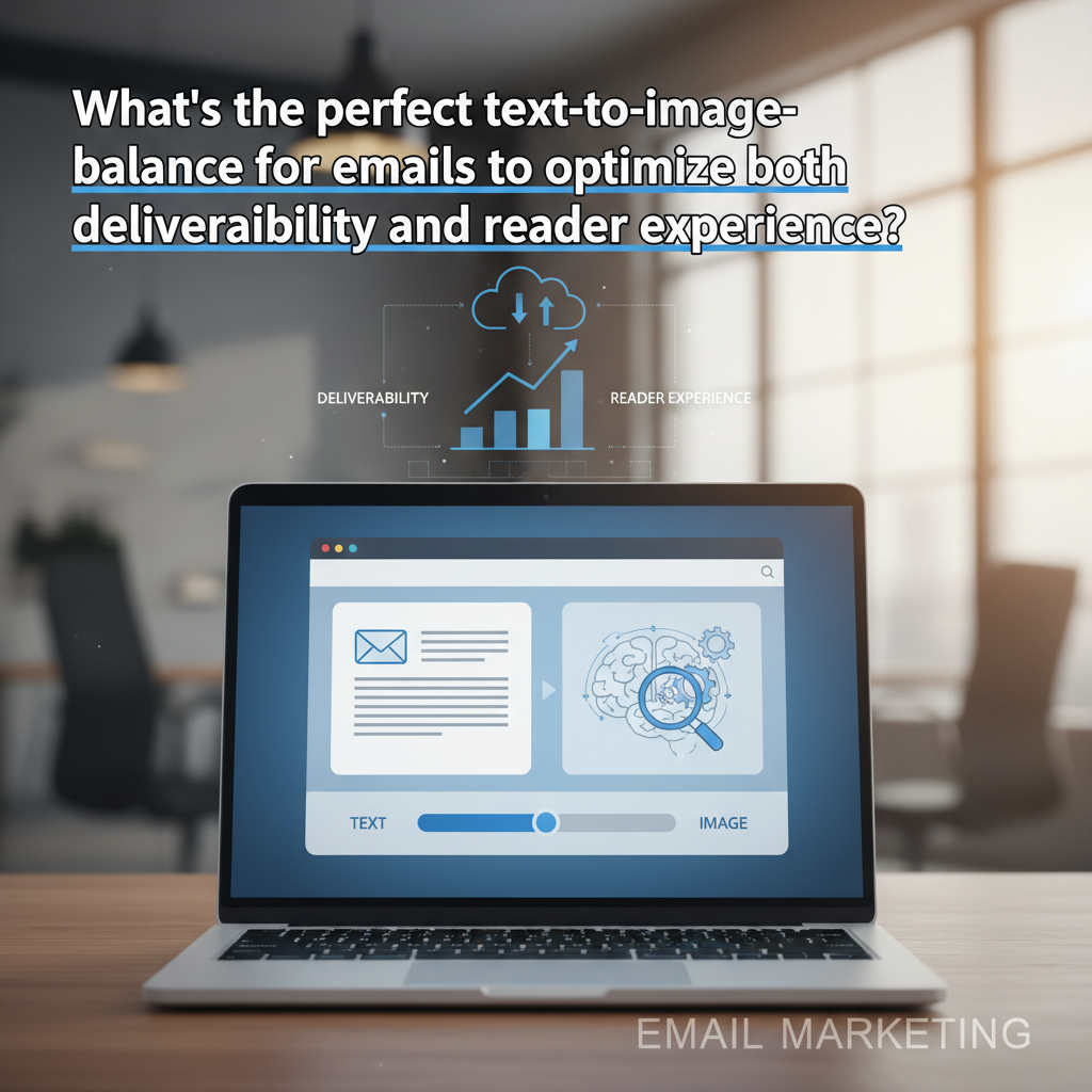
In this guide, we are moving beyond the outdated "60/40 rule." We will explore the modern, data-backed approach to text-to-image balance that satisfies 2025's machine learning algorithms, complies with accessibility standards, and survives the "images off" environment.
The Myth vs. Reality of the 60/40 Rule
If you've been in email marketing for more than a few years, you’ve likely heard the golden commandment: "Keep your email 60% text and 40% images to avoid the spam folder."
I still hear this advice repeated in marketing slack channels today. But here is the thing—it’s a relic.
Where the Rule Came From
The 60/40 rule originated in the early 2000s with SpamAssassin, a widely used spam filter. Back then, spammers tried to bypass keyword filters (which scanned for words like "Viagra" or "Free") by embedding their text inside images. To combat this, filters began penalizing emails with low text-to-code ratios or high image counts.
How Algorithms Read Emails in 2025
Today, major Email Service Providers (ESPs) like Gmail and Outlook rely on sophisticated machine learning models, including TensorFlow AI. They don't just count pixels.
While the strict mathematical ratio is dead regarding spam filtering, the principle of balance is more alive than ever for deliverability and engagement. Why? Because engagement drives reputation. If users delete your email because it loaded too slowly or didn't render, Gmail notices. And eventually, you end up in the Spam folder—not because of your image ratio, but because nobody reads your emails.
Deliverability Mechanics: How Images Impact the Inbox
It is easy to blame the content when deliverability drops, but often, the issue is technical. Let's break down the mechanics of how heavy imagery hurts your placement.
1. The 102KB Gmail Clipping Limit
This is the most common technical error I see. Google Support confirms that Gmail clips emails with a message size larger than 102KB. When an email is clipped, the code at the bottom is cut off.
Why is this a deliverability nightmare? Because your "Unsubscribe" link is usually in the footer. If that link is cut off, and a user can't easily opt out, they will mark you as spam. That is a direct hit to your domain reputation.
Note: This 102KB limit applies to the HTML code file size, not the hosted images themselves. However, image-heavy emails often require bloated HTML coding to position those images, pushing you closer to the limit.

2. Load Time and the 5-Second Rule
We live in an era of impatience. According to Kinsta's Email Marketing Statistics, 74% of users will delete an email if it doesn't open within 5 seconds.
I recently audited a campaign for a fashion retailer where the header image was a 4MB uncompressed PNG. On a 5G connection, it was fine. On a spotty 4G subway commute? It was a disaster. Large images consume mobile data and stall rendering. If your text is embedded in that image, the user sees nothing while they wait.
3. The "Image-Only" Spam Flag
While the 60/40 rule is outdated, sending a single large image with no text (a practice called "poster sending") is still a red flag. It mimics the behavior of "pump and dump" stock spam. According to Statista data from 2024, 45.2% of all email traffic is still identified as spam. To avoid being lumped into that statistic, you need at least 500 characters of text to help algorithms categorize your content contextually.
The Reader Experience: Accessibility & UX
This is where the argument shifts from "technical SEO" to human empathy. Even if your image-heavy email bypasses the spam filter, can your audience actually read it?
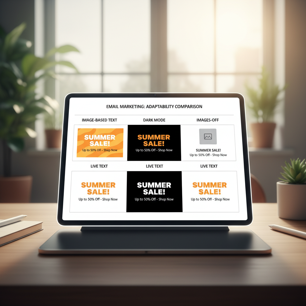
The "Images Off" Phenomenon
Many B2B environments using Outlook or enterprise security software block images by default to prevent tracking pixels and malicious payloads. If your "Call to Action" is a button designed in Photoshop, it vanishes.
Accessibility: The 2.2 Billion User Market
According to the World Health Organization (WHO), at least 2.2 billion people globally have a vision impairment. Many of these users rely on screen readers (software that reads text aloud).
Screen readers cannot read pixels. They read code. If your email is one giant image, the screen reader simply says "Graphic." You have effectively silenced your message for a massive segment of the population.
This is why Alt Text is not optional. According to Pathwire (Sinch), only 20% of marketers consistently use Alt text. Being in that 20% gives you a competitive advantage.
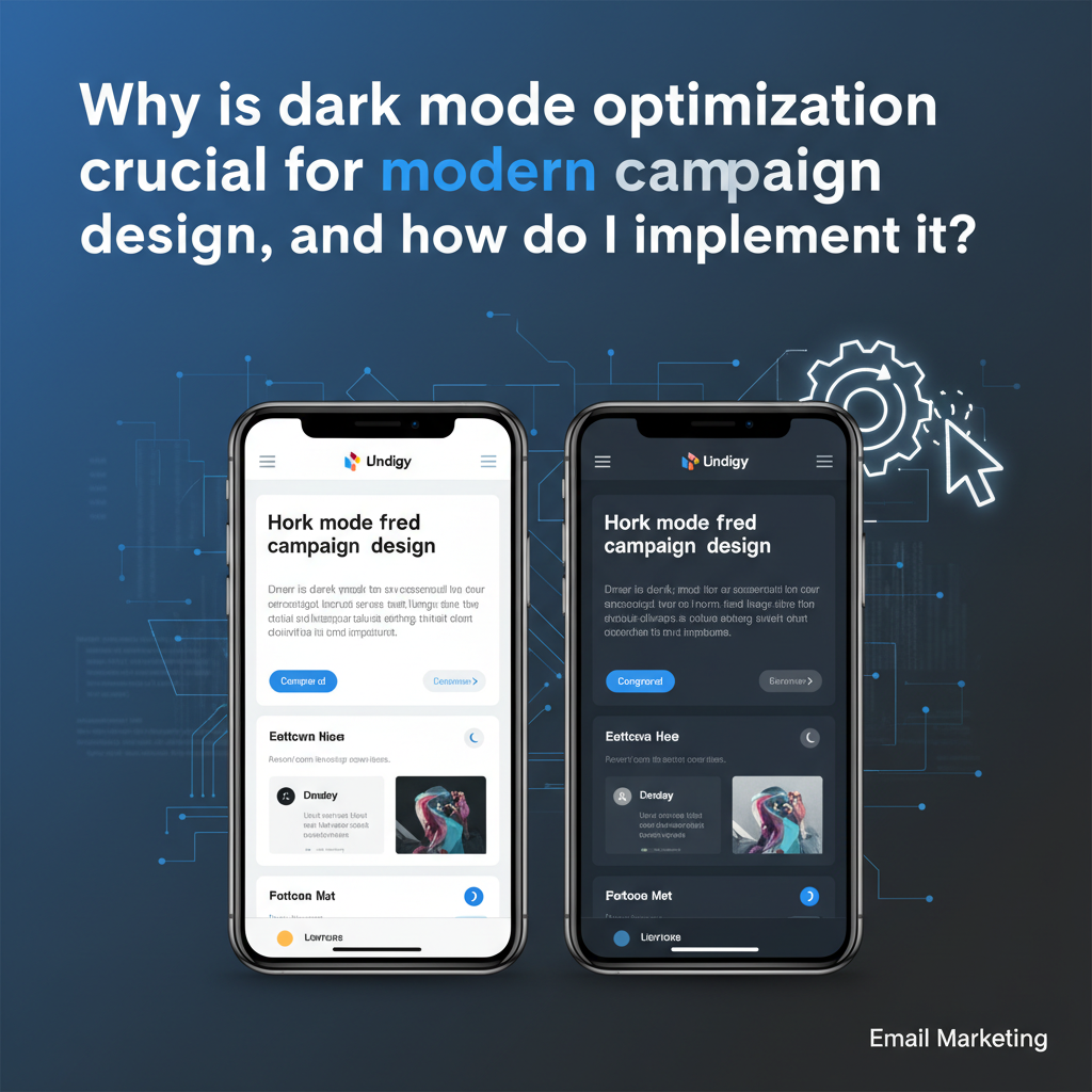
The Dark Mode Disruption
Dark Mode isn't a fad; it's a standard. Litmus research indicates that approximately 35% of email opens occur in Dark Mode. This presents a unique challenge for text-to-image ratios.
I've seen many designers use transparent PNGs for logos or icons with black text. In Light Mode, it looks clean against a white background. In Dark Mode, that black text disappears against the dark background. The solution? Use "live text" (HTML text) which automatically inverts colors based on the user's device settings, rather than locking colors into an image.
Strategic Visuals: When to Use Text vs. Images
So, what is the solution? It isn't to abandon images—visuals are crucial for emotional connection. The solution is strategic separation. Here is the framework I use for my clients.
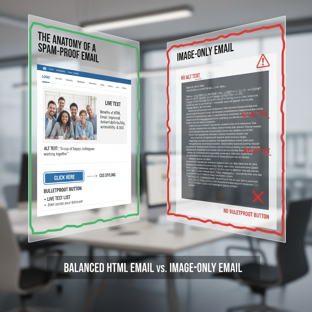
Use Live Text (HTML) For:
- The Value Proposition: Your main headline must be readable instantly.
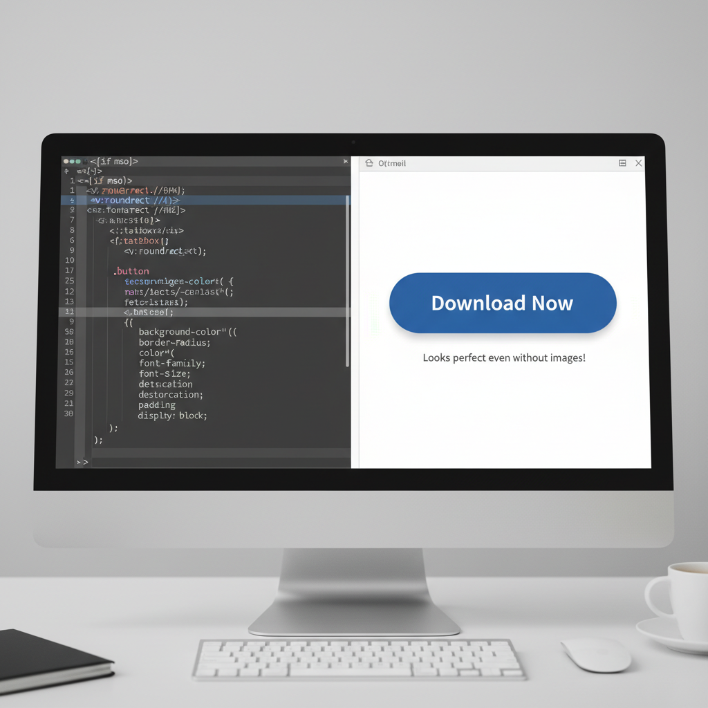
- The Call to Action (CTA): Never use image buttons. Use "Bulletproof Buttons"—these are buttons created with HTML and CSS (background colors, padding, borders). They are fully clickable even if images are blocked.
- Footer Information: Address, unsubscribe links, and legal disclaimers.
- Personalization: "Hi [Name]" works best in text. As Constant Contact notes, with Apple's MPP masking open rates, click-throughs are the new gold standard. You can't personalize a JPG easily, but you can personalize text to drive those clicks.
Use Images For:
- Product Showcases: High-res photos of what you are selling.
- Brand Vibe: Background textures or mood photography.
- Complex Data: Charts or graphs (but always include a summary of the data in the Alt text).
5 Steps to Test Your Email Balance
Before you schedule your next campaign, run it through this 5-step "Fail-Safe Framework." This ensures that no matter the ratio, the email performs.
1. The "Squint Test"
Step back from your screen and squint. Can you still identify the most important element (the CTA)? If your hierarchy relies solely on a large image, your design is fragile.
2. The "Code-Strip" Test
This is my favorite technique. Disable images in your browser or email client. Does the email still make sense? Can you still click a button to buy the product? If the answer is no, you are relying too heavily on images.
HubSpot data shows that in A/B tests, simpler emails often have higher click-through rates because they look less like advertisements.
3. The File Size Audit
Export your HTML file. Is it under 102KB? If not, minify your code. Remove unnecessary comments and white space. Ensure your images are hosted externally, not embedded as Base64 code.
4. Alt Text Verification
Hover over every image. Is there descriptive text? "Image_001.jpg" is a failure. "Blue running shoes side view" is a success.
5. The Mobile Check
Check the email on a phone with a poor data connection. Do the images load? If they don't, is the alt text styled (yes, you can style alt text with CSS!) to look presentable?
FAQ: Common Text-to-Image Questions
What is the best image to text ratio for email in 2025?
While the strict "60/40 rule" (60% text, 40% image) is no longer a hard spam filter trigger, it remains a healthy guideline for design. Ideally, aim for at least 500 characters of live text to ensure accessibility and proper indexing by inbox algorithms.
Do images affect email deliverability?
Indirectly, yes. Large image file sizes slow down load times, leading to deletions (negative engagement). Furthermore, image-only emails can trigger "promotion" tabs or spam filters because they lack the textual context algorithms need to categorize the message.
How do I reduce email size in Gmail?
To avoid Gmail's 102KB clipping limit, keep your HTML code clean. Minify your CSS, avoid copying and pasting directly from Word (which adds bloat), and ensure you aren't pasting large blocks of text as images.
Why are my email images not loading in Outlook?
Outlook for Windows uses Microsoft Word as its rendering engine, which is notoriously difficult. It often blocks background images and ignores padding. Always have a solid background color as a fallback for text designed over images.
Conclusion: Functionality Over Math
The quest for the "perfect" text-to-image balance isn't a math problem; it's a communication challenge. The days of worrying about a strict 60/40 split to please a robot are behind us. Today, your priority must be the human on the other side of the screen.
If you design for the worst-case scenario—where images are blocked, connections are slow, and vision is impaired—you inadvertently create the best-case scenario for deliverability. You create an email that is robust, accessible, and resilient.
My final advice is this: Don't ask "Is this too many images?" Ask "If these images disappear, does my message survive?" If the answer is yes, you are ready to send.