How to Engineer Email Call-to-Actions That Guarantee Conversions (The 2025 Framework)
Most marketers think a red button is enough. They slap a "Click Here" graphic at the bottom of a newsletter and hope for the best. But when you look at the raw data, that approach isn't just lazy—it's actively killing your ROI.
In my experience auditing hundreds of email campaigns, I’ve found that the difference between a 1% click-through rate (CTR) and a 15% CTR isn't luck. It's engineering. It is the deliberate application of behavioral psychology, visual hierarchy, and precise coding.
If you are looking for generic "best practices," this article isn't for you. This is a deep dive into the conversion engineering framework needed to build a high converting email call to action in 2025. We are moving beyond guesswork and using verified data to force the click.
Article Roadmap
The Psychology of the Click: Why We Convert
Before we touch a single line of HTML code, we have to understand the human brain. When a subscriber opens your email, they aren't reading; they are scanning. They are looking for a reason to leave or a reason to stay. Your CTA is the anchor.
The Von Restorff Effect (Isolation)
Also known as the "Isolation Effect," this psychological principle states that an item that stands out like a sore thumb is more likely to be remembered—and clicked. If your email is text-heavy and your link is just blue underlined text, it blends in.
I see this mistake constantly in B2B newsletters. The design is too "polite." To engineer a conversion, you must break the visual pattern.
Cognitive Load & Decision Fatigue
Every element in your email adds weight to the subscriber's cognitive load. If you give them three different buttons ("Read Blog," "View Sale," "Follow on Twitter"), you induce decision paralysis.
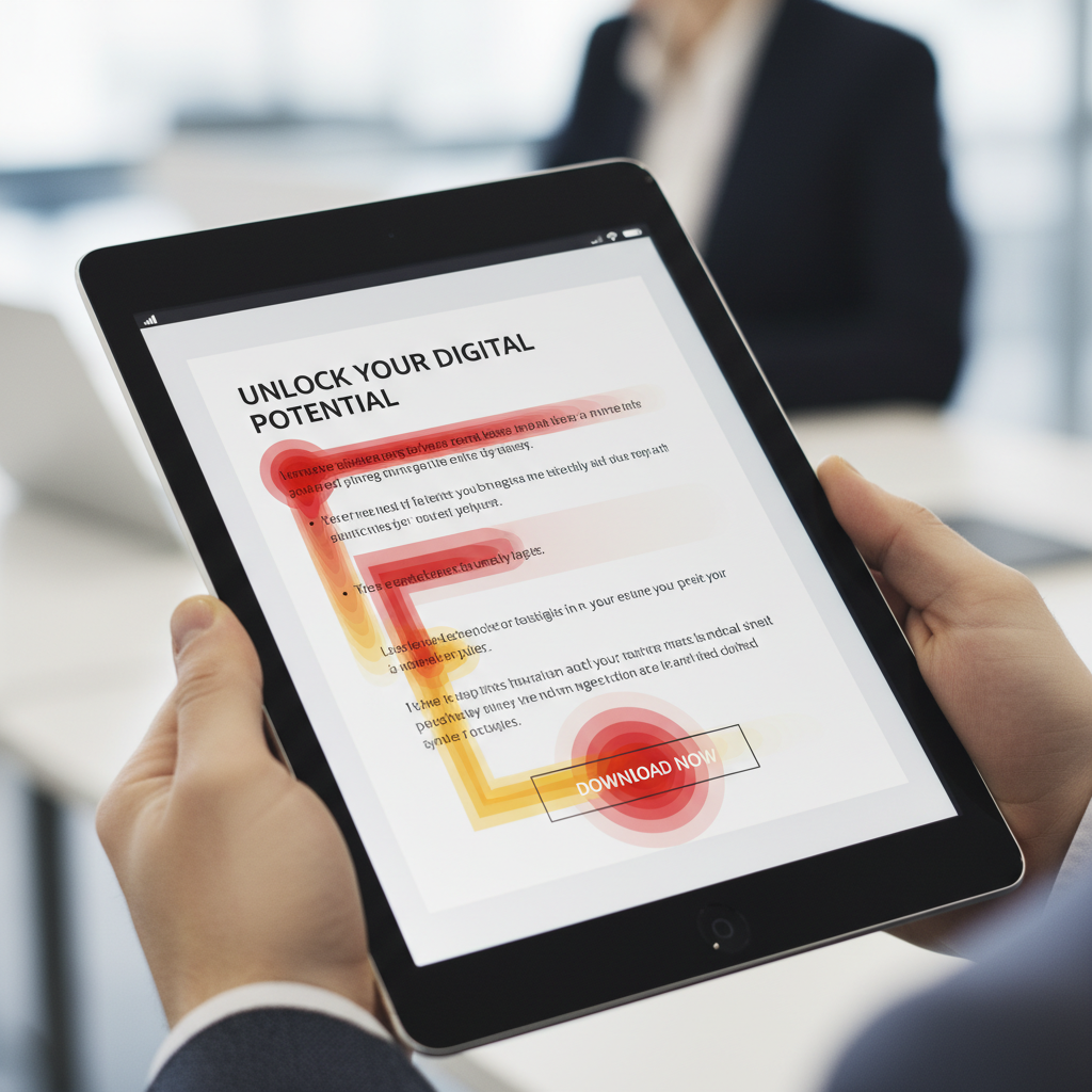
The F-Pattern Scanning Behavior
Eye-tracking studies consistently show that users scan screens in an F-shaped pattern. They read the headline, scan down the left side, and read across again only if something catches their eye. If your CTA isn't placed along this natural "gravity" of the eye, it’s invisible.
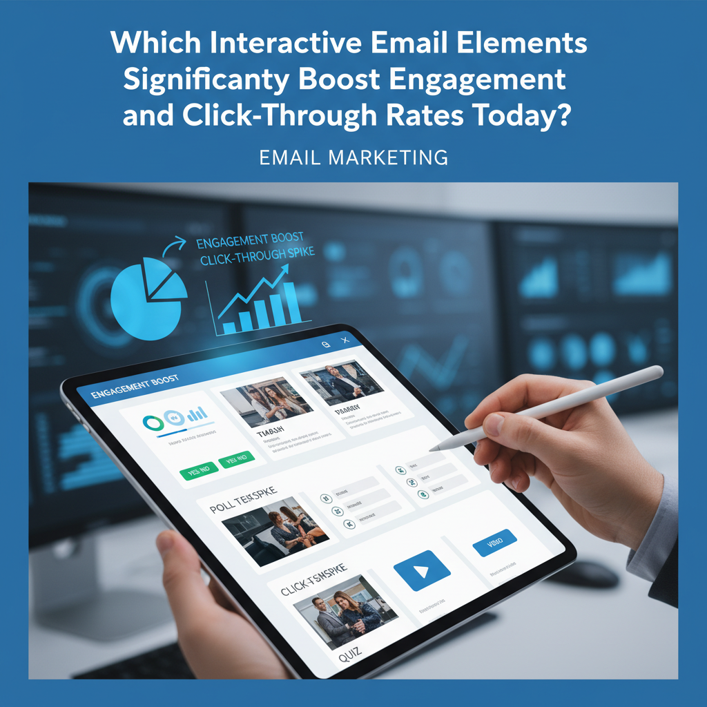
Analyzing the Data: 2024 Benchmarks & Trends
Opinions are nice, but data is better. Let's look at what the numbers from 2024 and 2025 reports are actually telling us about high converting email call to actions.
Buttons vs. Text Links: The 28% Gap
You might prefer the aesthetic of a text link, but the general public prefers buttons. According to Campaign Monitor's 2024 Benchmarks, button-based CTAs generate a 28% higher click-through rate compared to text-only links. Buttons mimic the apps and interfaces we use daily; they signal "interactivity" immediately.
The "One Goal" Rule
This is perhaps the most critical statistic for 2025 strategies. Data from WiserNotify (2024) indicates that emails with a single call-to-action can increase clicks by 371% and sales by a staggering 1,617%.
Why? Focus. When you remove secondary choices, you funnel 100% of the attention toward the conversion goal.
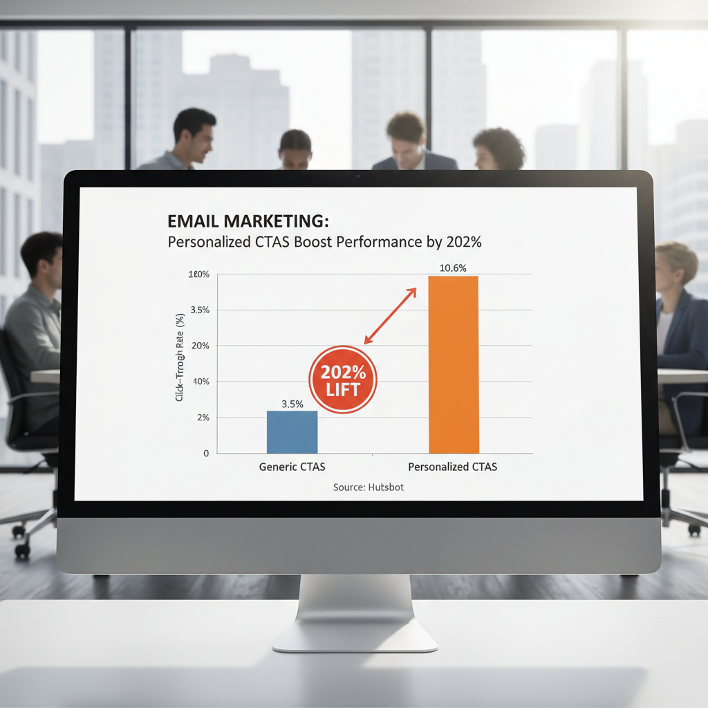
Personalization Is No Longer Optional
Generic buttons are dead. A 2024 HubSpot State of Marketing report found that personalized CTAs perform 202% better than basic versions. This doesn't just mean using a first name; it means smart CTAs that change based on lifecycle stage (e.g., showing "Upgrade Now" to free users and "Join Community" to Pro users).
The Anatomy of the Perfect CTA Button (Design Engineering)
Now, let's build the button. As an "email engineer," you need to consider three layers: The visual layer, the code layer, and the mobile layer.
Size Matters: The 44px Rule
In the mobile-first world, your mouse is a thumb. Apple’s Human Interface Guidelines and Android specs both suggest a minimum touch target size of 44x44 pixels. If your button is smaller than this, you are creating "fat finger" friction.
According to the 2024 Litmus State of Email report, optimizing CTAs for mobile devices (sizing and spacing) improves conversion rates by 32.5%. Furthermore, WiserNotify (2025) data suggests that increasing CTA button size to occupy the full screen width on mobile can increase click-throughs by 90%.
Color Theory vs. Contrast Ratios
There is no "best color" for a CTA. Red creates urgency, green implies go, blue implies trust. However, the real secret is contrast.
According to OptinMonster and Sender.net (2024), changing a CTA button color to a high-contrast opposite on the color wheel (relative to your background) can boost conversions by 21%. If your email background is white and your logo is blue, a blue button disappears. An orange button screams.
Accessibility Check: Ensure your button text and button background meet WCAG AA standards for contrast (usually a ratio of 4.5:1).
"Bulletproof" Buttons (The Code)
This is where most designers fail. They design a button with rounded corners using CSS (`border-radius`), but when it hits Outlook on Windows, it reverts to a square, ugly box because Outlook uses Microsoft Word's rendering engine.
To engineer a truly bulletproof button that looks identical in Gmail, Apple Mail, and Outlook, you need to use VML (Vector Markup Language) shadow code.
<!--[if mso]>
<v:roundrect xmlns:v="urn:schemas-microsoft-com:vml" xmlns:w="urn:schemas-microsoft-com:office:word" href="http://YOUR-LINK" style="height:40px;v-text-anchor:middle;width:200px;" arcsize="10%" stroke="f" fillcolor="#E74C3C">
<w:anchorlock/>
<center>
<![endif]-->
<a href="http://YOUR-LINK" style="background-color:#E74C3C;border-radius:4px;color:#ffffff;display:inline-block;font-family:sans-serif;font-size:16px;font-weight:bold;line-height:40px;text-align:center;text-decoration:none;width:200px;-webkit-text-size-adjust:none;">GET STARTED</a>
<!--[if mso]>
</center>
</v:roundrect>
<![endif]-->
Copywriting Engineering: Words That Force Action
Design captures attention; words close the deal. The text on your button is arguably the most valuable real estate in your entire email.
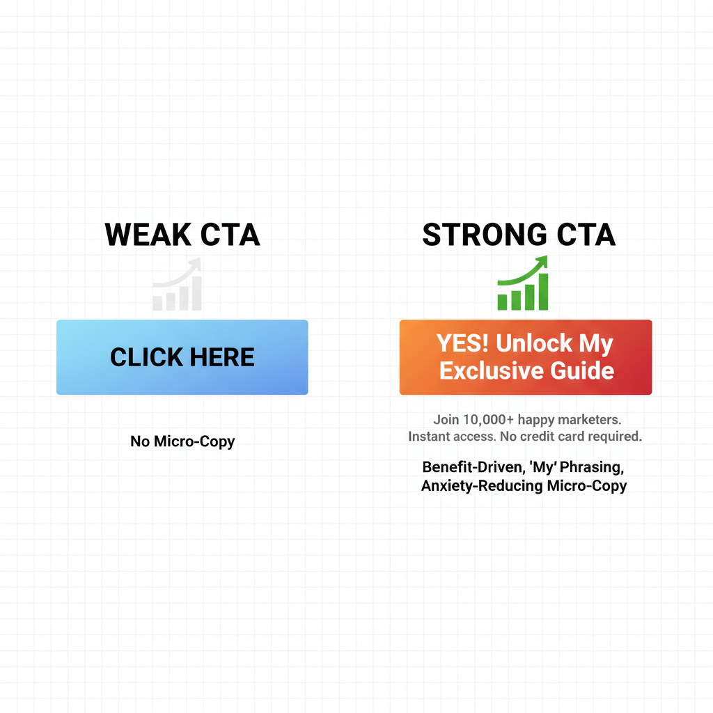
First-Person Relevance ("My" vs. "Your")
One of the most famous A/B tests in digital marketing history involves a simple pronoun change. In a classic case study by ContentVerve (cited by Unbounce), changing button text from "Start your free trial" to "Start my free trial" increased CTR by 90%.
Why? "Your" feels like the marketer talking to you. "My" feels like the user taking possession of the value. It’s a subtle psychological shift that engineers ownership.
Benefit-Driven Verbs
Stop using "Submit," "Click Here," or "Download." These are high-friction words. They imply work. Instead, use benefit-driven verbs.
- Instead of "Submit" → "Send Me The Guide"
- Instead of "Register" → "Save My Spot"
- Instead of "Buy Now" → "Get 50% Off"
Real-World Case Study: PartnerStack
PartnerStack, a B2B SaaS company, faced low conversion rates with the generic copy "Book a Demo." By engineering the copy to be more benefit-driven ("Get Started"), they saw a 111.55% increase in conversion rates. The lesson? Lower the perceived commitment.
Low-Friction Micro-Copy
Micro-copy is the tiny text right below the button. This is your safety net. It resolves anxiety. Adding a line like "No credit card required" or "Unsubscribe anytime" removes the fear of the click.
Advanced Placement Strategy
Where you place the button dictates who sees it. The data on this is incredibly polarizing depending on the context.
Above the Fold vs. The "Deep Read" Anchor
The general rule is "Above the Fold." According to Sender.net's 2025 Trend Analysis, CTAs placed above the fold (visible without scrolling) perform 304% better than those buried at the bottom.
However, I have to add a nuance here based on my own testing. If you are selling a high-ticket item or a complex service, placing the CTA too early can hurt you. The user hasn't been "sold" yet. In these cases, use the Inverted Pyramid layout:
- Header Image: Grabs attention.
- Headline: States the promise.
- Body Copy: Builds desire.
- CTA: Captures the action.
The Plain Text Exception
While buttons dominate marketing emails, cold outreach is different. If you are sending a B2B sales email that is meant to look like a personal 1-on-1 note, a flashy HTML button looks like spam.
According to Close.com and Databox (2024), in plain-text cold outreach, text links often outperform buttons by 17% due to perceived authenticity. In this specific context, the "engineering" requires you to strip away the design to build trust.
The Video Play Button
If you have video content, don't just link to it. Use a static image of the video with a "Play" button overlay as your CTA. Fortay Media (2024) reports that including video thumbnails with a play button CTA can increase CTR by 300%. The human brain is conditioned to click "Play."
FAQ: Solving Common Conversion Blockers
What is the average click-through rate for email in 2024/2025?
The global average hangs around 2.5% to 3% across all industries. However, highly segmented and personalized campaigns often see rates between 10% and 15%.
How many CTAs should be in one email?
Ideally, one. The "One Goal" rule suggests that emails with a single primary CTA outperform multi-CTA emails by 371%. If you must include secondary links (like a footer), keep them visually distinct and less prominent.
What is the best color for email call to action buttons?
There is no universal "best" color. The highest converting color is one that provides high contrast against your email background and brand palette. However, bright colors like Orange, Red, and Green typically draw the eye faster than neutral tones like Grey or Black.
Should I use a button or a text link?
For newsletters, e-commerce, and promotions, use buttons (28% higher CTR). For cold outreach or personal relationship building, use text links (17% higher CTR).
Conclusion: The "Click Audit" Checklist
Engineering a high converting email call to action isn't about guessing; it's about respecting the data. You now know that "My" works better than "Your." You know that 44 pixels is the minimum safe zone for mobile. You know that contrast beats color preference.
Before you hit send on your next campaign, run your CTA through this final audit:
The 2025 CTA Engineering Checklist
- Visual: Is there only one primary CTA?
- Copy: Does the button text complete the sentence "I want to..."?
- Code: Is it a bulletproof HTML/VML button (not just an image)?
- Mobile: Is it at least 44px tall and spanning the screen width?
- Psychology: Is there micro-copy to reduce anxiety?
The difference between a deleted email and a new customer is often just a few pixels of padding and a verb change. Treat your CTA like a product, engineer it with precision, and the conversions will follow.