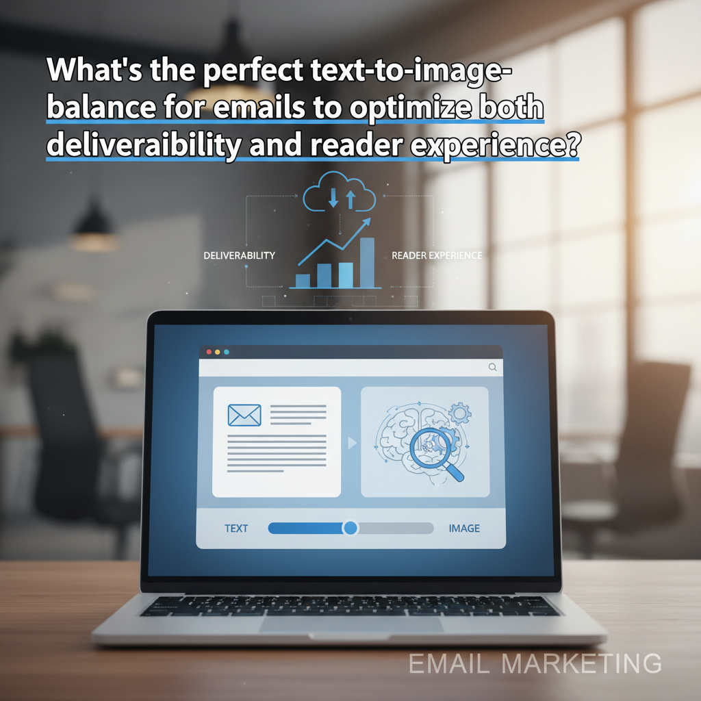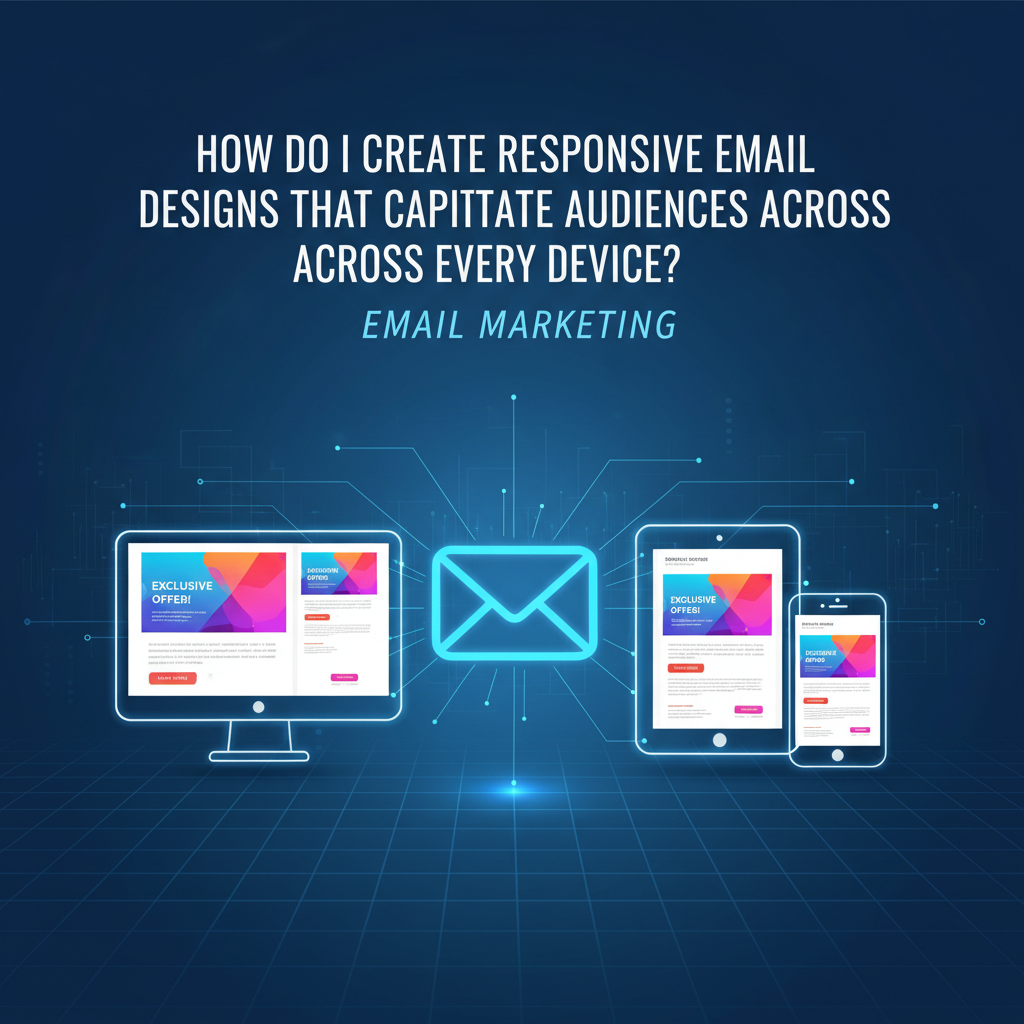
How to Create Responsive Email Designs That Captivate Across Every Device (2025 Guide)
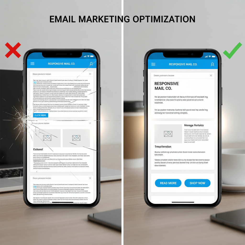
Let's be honest: coding emails often feels like trying to build a skyscraper using only tools from 1999. In my decade of experience as a developer, nothing has been quite as humbling—or frustrating—as crafting a beautiful design, only to watch it shatter into pieces when opened in Outlook.
But the stakes have never been higher. According to Growth-Onomics, by the end of 2025, 55% of all email opens will happen on mobile devices. The margin for error is non-existent. If your design doesn't adapt instantly, Groupmail reports that 80% of recipients will delete it in under 3 seconds.
We are moving beyond basic templates. This isn't just about making things "stack" on a phone. It’s about the "Hybrid/Spongy" coding techniques, dark mode fixes, and accessibility standards that define 2025's top-performing emails.
The Non-Negotiables of Modern Email Design (2025 Benchmarks)
Before we touch a single line of code, we need to realign our strategy. For years, designers treated mobile as an afterthought—a shrunk-down version of the desktop experience. That mindset is now a liability.
The Mobile-First Mindset: Why Desktop is Now Secondary
The numbers don't lie. While we often design on large 27-inch monitors, our audience is viewing our work on 6-inch screens. This shift isn't just consumer-facing. SalesSo notes that 35% of business professionals view their emails on mobile devices, and a staggering 61% of B2B emails are first opened on mobile.
This means your "hero image" with small text overlay isn't just hard to read; it's invisible to the majority of your B2B prospects. If the key value proposition isn't legible without zooming, you've lost the conversion.
Optimal Dimensions: The 600px vs. 640px Debate
I often get asked, "Is 600px still the standard?" The short answer is yes, but with nuance. While screens are higher resolution, email clients like Outlook and Yahoo Mail still use a reading pane that constraints width on desktop.
Stick to a maximum width of 600px to 640px. Going wider risks horizontal scrolling in traditional desktop clients, which is a massive user experience failure. However, inside that container, everything must be fluid.
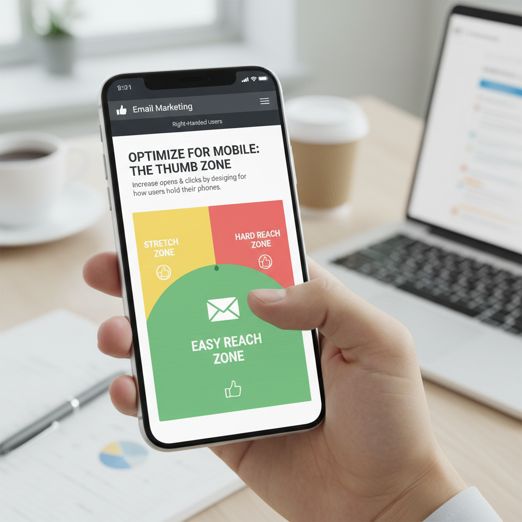
The "Thumb Zone": Designing for Touch
Mouse clicks are precise; thumbs are not. I can't tell you how many times I've tried to unsubscribe from a newsletter only to accidentally click a social link because they were jammed together.
According to Benchmark Email, tappable buttons must be at least 44px in height to accommodate the average thumb. Furthermore, they recommend using larger fonts—specifically 16px or larger—for body text to ensure readability without zooming.
Technical Framework: Fluid Grids vs. Media Queries
Here is where the rubber meets the road. "Responsive" email isn't just one technique; it's a combination of fluid grids (using percentages) and media queries (conditional CSS).
How to Write CSS Media Queries for Email
Most modern email clients (iPhone, Gmail App, Samsung Mail) support embedded CSS media queries. This allows us to change styles based on the screen width.
@media screen and (max-width: 600px) {
    .container {
        width: 100% !important;
        min-width: 100% !important;
    }
    .mobile-hidden {
        display: none !important;
    }
    .img-full {
        width: 100% !important;
        height: auto !important;
    }
}
The "Spongy" Technique: Ensuring Outlook Compatibility
Here is the tricky part. Outlook (specifically the desktop versions using Microsoft Word as a rendering engine) ignores `max-width` and media queries. If you just set a div to `max-width: 600px`, Outlook will often stretch it to the full width of the monitor.
To fix this, we use the Hybrid/Spongy coding technique. We wrap our fluid divs inside a "Ghost Table"—conditional comments that only Outlook sees.
<!--[if mso]>
<table role="presentation" border="0" cellspacing="0" cellpadding="0" width="600">
<tr><td>
<![endif]-->

<div style="max-width:600px; margin:0 auto;">
    <!-- Your Email Content Here -->
</div>

<!--[if mso]>
</td></tr>
</table>
<![endif]-->
I use this snippet in every single master template I build. It forces Outlook to respect the 600px width via a table, while every other client sees a responsive div.
Managing Images: Retina Support
Screens are pixel-dense. If you save an image at exactly 600px wide, it will look fuzzy on an iPhone 15 or a MacBook Pro. The solution is to save your image at 1200px wide (2x size) but code it to display at 600px.
<img src="hero-2x.jpg" width="600" style="width: 100%; max-width: 600px; height: auto;">
This ensures crisp visuals on high-DPI screens while maintaining the correct layout structure.
Advanced Visuals: Dark Mode & Interactive Elements
Dark Mode is no longer a niche preference for developers. According to Marketing LTB, approximately 40% of subscribers view emails in Dark Mode. Ignoring this means nearly half your audience might see black text on a dark gray background—rendering your message unreadable.
Solving the Dark Mode Dilemma
Email clients handle Dark Mode in three ways: they don't change anything, they invert colors fully, or they invert only the background. To control this, you need specific meta tags and CSS.
First, enable Dark Mode support in your ``:
<meta name="color-scheme" content="light dark">
<meta name="supported-color-schemes" content="light dark">
Then, use this media query to target dark mode users specifically:
@media (prefers-color-scheme: dark) {
.body-text {
color: #ffffff !important;
}
.dark-mode-bg {
background-color: #1e1e1e !important;
}
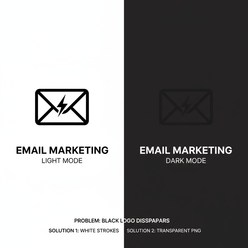
}Pro Tip: The Logo Fix
If your logo is black text with a transparent background, it will disappear in Dark Mode. I always recommend adding a subtle white stroke around your dark logo text, or saving it as a PNG with a slight outer glow. It’s invisible on white backgrounds but makes the logo pop on dark ones.
Typography that Scales
While web designers use `rem` or `em` units, email requires pixel (`px`) units for consistency across clients. However, to ensure readability, you must be generous with line height. A good rule of thumb is a line-height of 1.5 (e.g., 16px font / 24px line-height).
Accessibility: The Invisible UX Booster
Accessibility often gets pushed to the bottom of the priority list, but it shouldn't. Aside from the ethical imperative, accessible emails are easier for everyone to read, including voice assistants like Siri or Alexa.
Semantic HTML
Screen readers rely on structure. Don't just style a `span` to look like a header. Use `h1`, `h2`, and `p` tags. For layout tables (which we are forced to use for Outlook), always include `role="presentation"`. This tells the screen reader, "This table is just for design, ignore the structure."
Alt Text Strategy
Many enterprise email clients block images by default. If your email is entirely image-based, the user sees a blank square. Strategic Alt Text is your backup. Instead of "Image 1," use descriptive text like "50% Off Summer Collection - Click to Shop."
Testing & Troubleshooting
You can code perfectly, but email clients are unpredictable. Testing is mandatory.
The "Gmail Clipping" Problem
Have you ever seen the message "[Message clipped] View entire message" at the bottom of an email? This is a conversion killer. Gmail clips any HTML email that exceeds 102KB in file size.
This file size limit includes your HTML code, inline CSS, and text—but not the images themselves (since those are loaded externally). To avoid this:
- Minify your HTML (remove extra spaces and comments).
- Avoid redundant inline styles.
- Keep your code clean.
Testing Across Clients
I rely heavily on tools like Litmus or Email on Acid. These platforms generate screenshots of your email across 90+ clients. If you can't afford these tools, at a minimum, test on:
- iOS Mail (iPhone)
- Gmail App (Android)
- Outlook Desktop (Windows)
- Gmail (Desktop Browser)
Case Studies: Brands Winning with Responsive Design
Theory is great, but let's look at real-world results. In-Box recently published several case studies demonstrating the ROI of responsive, optimized email flows.
Puresport (Wellness Brand)
The Challenge: They needed to move beyond basic email marketing to support a complex product mix.
The Strategy: They implemented detailed customer profiles and highly responsive, educational flows designed for mobile consumption.
The Results:
- 354% increase in total email revenue.
- 59% higher click rates.
- 47% boost in open rates.
Skinny Fizz (Beverage)
The Challenge: The brand suffered from low engagement and generic messaging that didn't resonate on mobile.
The Strategy: They shifted to customized automations aligned with their brand voice, optimized strictly for the "Thumb Zone."
The Results: Email revenue jumped by a massive 921%, with click rates improving by 101%.
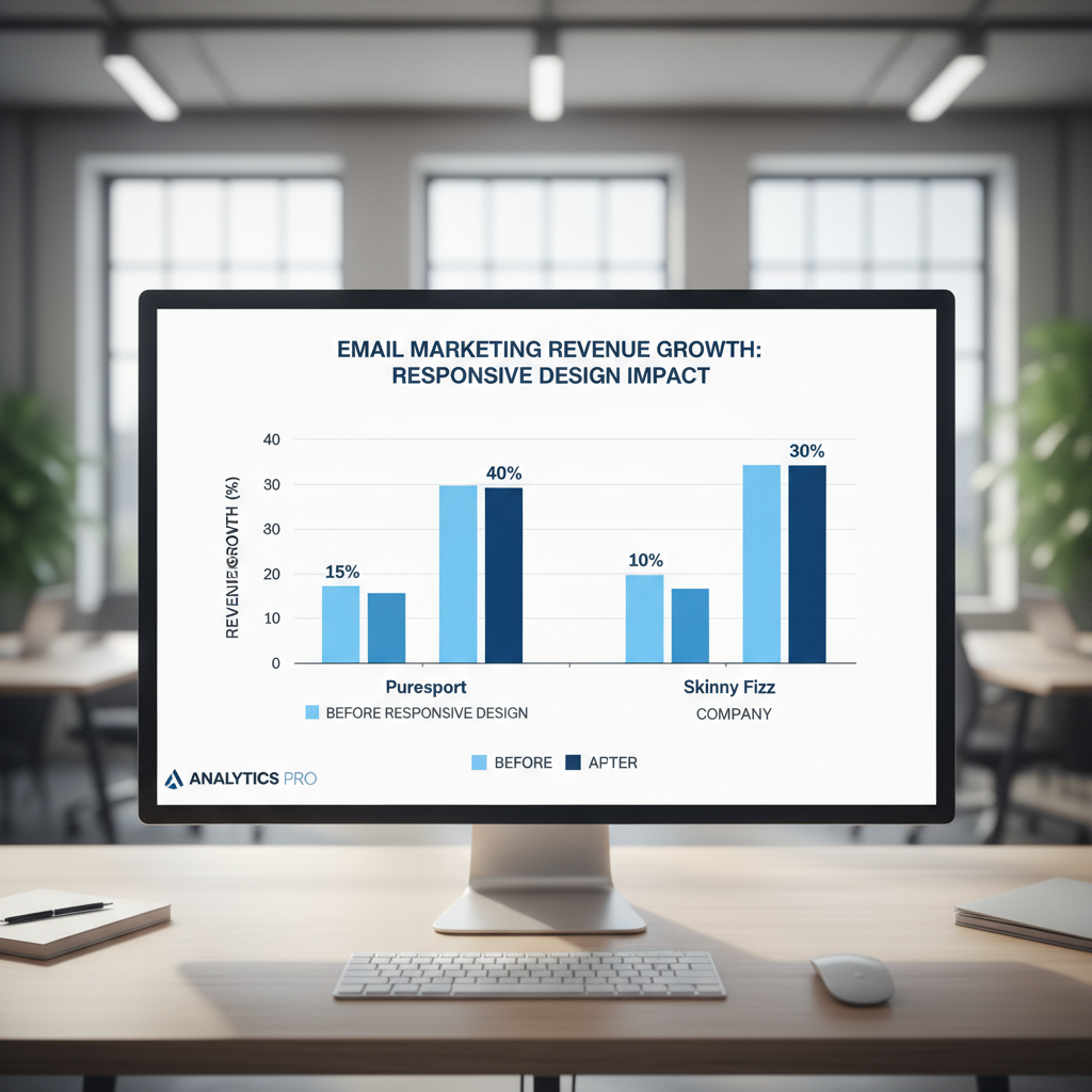
These examples highlight a critical truth: MageComp states that optimizing emails for mobile can enhance click-through rates by as much as 40%. The investment in code quality pays for itself.
FAQ: Common Responsive Design Headaches
Why does my email look broken in Outlook?
Outlook for Windows uses Microsoft Word to render HTML, which has very limited CSS support. It does not support Flexbox, Grid, or even `float`. You must use tables (`