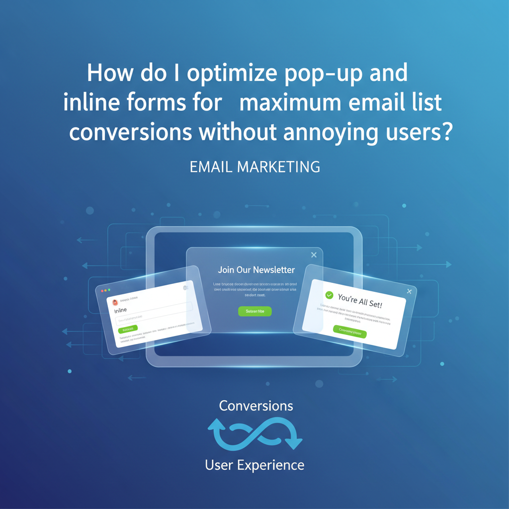
How to Optimize Pop-up and Inline Forms for Maximum Conversions (Without Annoying Users)
You have less than 0.05 seconds to make a first impression. In that literal blink of an eye, your email signup form acts as either a welcoming concierge or a slammed door in your visitor's face.
I’ve audited hundreds of websites where the marketing team treats lead generation like a hostage situation: immediate full-screen takeovers, confusing "X" buttons, and aggressive copy. It’s no wonder users are installing ad blockers at record rates.
But here is the reality I see in the data: you cannot afford to ignore list building. With global email users forecast to reach 4.5 billion by the end of 2025 according to Radicati Group, email remains the only digital asset you truly own.
So, how do you balance aggressive growth with user empathy? How do you optimize email signup forms so they feel like a service rather than an interruption? In this guide, I’m breaking down the "Respectful Engagement" framework—a strategy blending behavioral psychology, technical precision, and modern UX to triple your growth.
Article Roadmap:

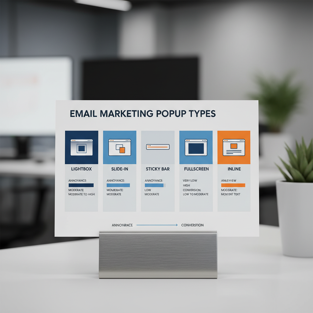
The Great Debate: Inline Forms vs. Pop-ups (Data Comparison)
If you ask a UX designer, they will tell you pop-ups are the devil. If you ask a conversion copywriter, they will tell you pop-ups are the holy grail. Who is right? In my experience, the data settles the argument, but context dictates the strategy.
Benchmarking Conversion Rates
Let's look at the hard numbers. If you rely solely on a static form in your footer or sidebar, you are leaving money on the table.
According to OptiMonk's 2025 Pop-up Statistics & Benchmarks, the average conversion rate for top-performing pop-ups is 42.35%, while the average across all industries sits at 11.09%. Contrast this with standard inline forms, which often struggle to break the 1-2% barrier.
Does this mean you should delete your inline forms? Absolutely not. Inline forms build trust. They are there for the user who is looking to subscribe. They represent "high-intent" leads who are often more valuable long-term.
The Hybrid Strategy
The most successful sites I manage don't choose one side. They use a hybrid approach:
- Inline Forms: Embedded in high-value blog content (content upgrades) and the website footer for "scavengers" (users actively looking to connect).
- Pop-ups (Modals/Slide-ins): Deployed dynamically to catch "browsers" who engage with content but haven't committed.
The "Annoyance-Free" Timing & Trigger Formula
The primary reason users hate pop-ups isn't the offer; it's the interruption. Displaying a modal the second a visitor lands on your site is like proposing marriage on a first date—it’s desperate and scary.
To optimize email signup forms effectively, we need to leverage behavioral triggers.
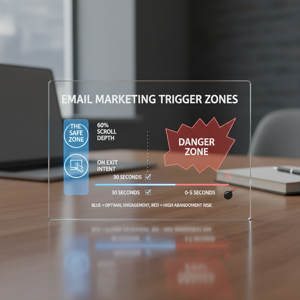
Exit-Intent: The Second Chance
Exit-intent technology tracks mouse movement (on desktop) to detect when a user is about to leave the browser window. This is the least intrusive method because you are only interrupting a departure, not the consumption of content.
Data from WiserNotify (2025) indicates that exit-intent technology can successfully recover 10-15% of abandoning visitors. For a site with 50,000 visitors, that is 7,500 potential leads saved annually.
Scroll-Depth vs. Time-Based Triggers
I frequently see marketers set pop-ups to trigger after 5 seconds. This is a mistake. Time is a poor proxy for interest. A user might have the tab open but be looking at their phone.
Instead, use Scroll Depth. Triggering a slide-in or pop-up when a user reaches 50-70% of the page ensures they have actually consumed your content and received value before you ask for something in return.
The "Second Page View" Rule
For premium brands, I recommend suppressing all aggressive pop-ups on a user's first page view. Let them explore. Trigger the form only when they navigate to a second page. This signals they are engaged, significantly increasing the likelihood of conversion while preserving the initial user experience.
Mobile-First Optimization: Beyond Just "Responsive"
It is 2025. If your form strategy is "make the desktop pop-up smaller," you are failing. Wisepops (Sept 2025) reports that mobile pop-up campaigns now drive 38% more conversions than desktop campaigns. Yet, this is where most technical errors occur.
Navigating Google's Intrusive Interstitial Penalty
Since 2017, Google has penalized mobile sites that show "intrusive interstitials" (pop-ups that cover the main content) immediately upon landing from search results. This hurts your SEO.
How to stay safe:
- Avoid Full-Screen Modals on Entry: On mobile, use "Teasers" or "Sticky Bars" (floating bars at the bottom/top) that take up less than 30% of the screen.
- Touch Targets: Ensure your "Close" (X) button is at least 44x44 pixels. Nothing induces "rage clicks" faster than a tiny close button on a smartphone screen.
- Speed Impact: Heavy JavaScript libraries for forms can tank your Core Web Vitals (INP and LCP). Ensure your popup script loads asynchronously (defer/async) so it doesn't block the rendering of the main content.
Psychology of Micro-Interactions & UX
Optimization is psychology applied to design. You are asking for personal data; you must reduce the "cost" of that transaction in the user's mind.
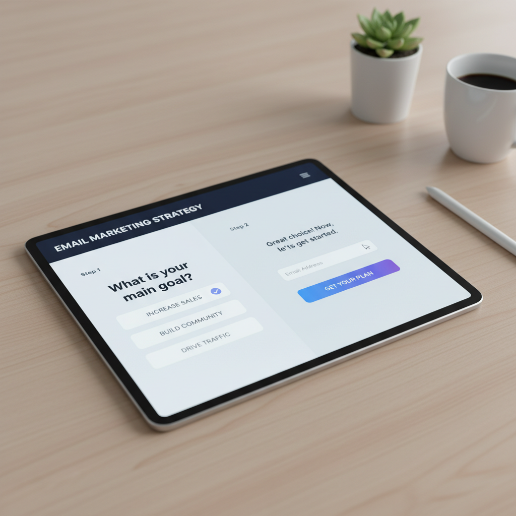
Reducing Cognitive Load: The Multi-Step Approach
It seems counterintuitive: wouldn't adding more steps decrease conversions? Surprisingly, no. The "Zeigarnik Effect" suggests that people are compelled to finish tasks they have started.
By asking a low-threat question first (e.g., "Do you want 20% off?" [Yes/No]), you get a micro-commitment. Once they click "Yes," they are psychologically primed to complete the next step (entering the email).
Research from IvyForms (Nov 2025) shows that multi-step pop-ups convert 86% higher than single-step forms that ask for an email immediately.
Visual Feedback & Dopamine
Micro-interactions matter. When a user clicks "Submit," does the button simply freeze? Or does it transform into a loading spinner and then a checkmark? These visual cues provide reassurance.
Furthermore, consider the "Joy of Missing Out" (JOMO) vs. "Fear of Missing Out" (FOMO). While FOMO (countdown timers) works—converting 112% better on mobile according to WiserNotify—positive reinforcement often builds better long-term brand equity.
Technical Implementation & Accessibility (The Missing Link)
Most guides skip this, but as a professional, you cannot. An inaccessible form is a legal liability and a lost revenue stream.
WCAG 2.1 Compliance Checklist
To optimize email signup forms for all users, including those using screen readers, you must adhere to WCAG guidelines:
- Focus Trapping: When a modal opens, the keyboard focus must move inside the modal and stay there until it is closed. If a user tabs past the form to the background content while the popup is open, the form is inaccessible.
- ARIA Labels: Your close button should not just be an "X" or an icon. It needs `aria-label="Close popup"` in the HTML so screen readers can interpret it.
- Escape Key Support: Users must be able to close the popup by hitting the "Esc" key.
Privacy by Design: GDPR & Zero-Party Data
In the era of privacy, trust is a conversion metric. Generic "Subscribe for updates" text is dead. You need explicit consent.
Consider collecting Zero-Party Data. Instead of just asking for an email, ask for a preference (e.g., "I'm interested in: [Men's Clothing] [Women's Clothing]"). This allows you to segment immediately. According to a report by Epsilon referenced in Mailercloud's Trends 2025, personalized emails based on this data deliver 6x higher transaction rates.
5 Proven Strategies to Boost Conversions (Case Studies)
Theory is great, but execution wins. Here are specific strategies backed by verified case studies that highlight how to optimize without annoyance.
1. The "Content Upgrade" (Inline Mastery)
Instead of a generic site-wide newsletter form, create a specific lead magnet for your top 5 blog posts. If the post is about "Paleo Dieting," the inline form should offer a "7-Day Paleo Meal Plan PDF."
Evidence: Thinkific used this strategy, creating tailored landing pages and inline forms, which generated over 150,000+ conversions over two years (Startup Voyager Case Study, 2024).
2. The Gamified "Spin-to-Win"
The Strategy: Use a wheel-of-fortune style popup.
The Caveat: Use this only for Ecommerce. It tends to attract "freebie seekers," but the volume is undeniable.
Evidence: Organic Aromas implemented an exit-intent version of this and achieved a 150% increase in signups, capturing 661 leads in 4 weeks (Omnisend Case Study, 2025).
3. The Quiz Funnel
The Strategy: Replace the form with a quiz to help the user solve a problem.
Evidence: Run Gum replaced their standard form with an interactive quiz. This didn't just capture emails; it segmented users by running habits. The result was a 229% increase in conversion rate (Blend Commerce Case Study, 2024).
4. The Teaser Sticky Bar
The Strategy: Keep a small "Get 10% Off" tab visible on the side or bottom of the screen. It only expands when clicked.
Why it works: It puts the user in control. It satisfies the "JOMO" (Joy of Missing Out) crowd who hates interruptions but wants the offer eventually.
Frequently Asked Questions
Do pop-ups still work in 2025?
Yes, absolutely. As noted earlier, the average top-performing pop-up converts at over 40%. The difference in 2025 is that "smart" pop-ups (targeted, timed, and relevant) work, while generic "spammy" pop-ups get blocked or ignored.
How many fields should a signup form have?
Keep it minimal. Data from WPForms / IvyForms (Aug 2025) suggests that reducing form fields from 4 to 3 can increase conversion rates by almost 50%. Ideally, ask for just the email, or email + first name. If you need more info, use a multi-step form.
What is a good conversion rate for email forms?
Benchmarks vary by industry, but generally, an inline form should aim for 1-2%, while a well-optimized pop-up should aim for 4-8%. If you are below 2% on your pop-ups, your offer or your timing is off.
How do I stop pop-ups from being annoying?
Use "frequency capping." Configure your tool so that if a user closes the pop-up, they do not see it again for at least 7-14 days. Also, ensure the "Close" button is visible immediately—do not make users wait a timer out to close the ad.
Ready to Transform Your List Growth?
The days of "batch and blast" are over. Start by auditing your current forms for mobile compliance and implementing the "Second Page View" rule today.
Conclusion: From Lead Capture to Value Exchange
The language we use matters. We often talk about "capturing" leads or "targeting" users. But in reality, successful email growth is about a value exchange.
To optimize pop-up and inline forms effectively, you must stop viewing them as distinct from your user experience. They are part of it. A well-timed exit-intent popup that offers a genuinely helpful resource isn't an annoyance—it's a service. A mobile-optimized sticky bar isn't an intrusion—it's a convenient tool.
Start small. Implement the exit-intent trigger. Ensure your WCAG accessibility is up to par. Test a multi-step flow. The data shows the traffic is there; it’s up to you to open the door properly.